"One True Sentence" is chronologically the first novel in the Hector Lassiter series, and it is set in 1924 Paris.
For those not familiar with the series, it revolves around Lassiter, a novelist and screenwriter who increasingly becomes noted for blending his life and art, sometimes to startling or even dangerous effect.
The novels are best described as literary historical thrillers and typically feature real historic personages and events, faithfully depicted, often in far flung locations.
"One True Sentence" originally appeared from St. Martin's Minotaur in February 2011. In original publication sequence, it was the fourth Lassiter novel to see the light of day.
Its cover and packaging was radically different from the three titles that preceded it, and that embodied a growing concern I had as my Lassiter books went out into the world: Across four linked novels, there were four vastly different branding concepts playing out. Not one of the four books clearly stood out as being linked to another.
Someday, I promised myself, I would see the Lassiter series presented in uniform editions, fronted by something much closer to the striking covers I saw in my mind's eye but which became twisted or lost in the process of working with two different publishers, three editors and four different designers.
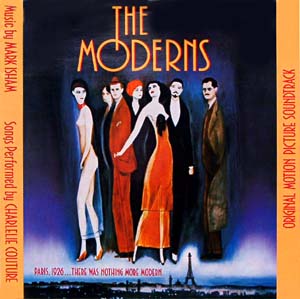
 OTS was given a painted cover by the sublime Echo Chernik. Echo did a wonderful job of catching a sense of the dreamy, boozy, floating party that was Paris in the early 1920s — at least for the literary and artistic expatriate types stalking the Left Bank in those days. If Ms. Chernik had provided illustrations for the prior three Lassiters, branding-wise, we would have had something pretty wonderful, I think.
 Look close at her illustration for "One True Sentence," and you'll find lurking behind Hemingway a pensive Gertrude Stein and a brooding Louise Brooks, (the silent screen siren is standing in for Hector's great love, fellow writer Brinke Devlin; Brinke is said to resemble Brooks in many ways).
For OTS's French publication, Belfond — which chose to market all of my books with covers featuring photographs of women — went this direction, cropping in close on the face of some 1920s belle:
When the folks at Betimes and I began to discuss branding strategies and cover concepts for the Hector Lassiter series, we knew we wanted to put across location, some of the more recognizable historical figures appearing from book to book, and to give face to Hector Lassiter for the first time.
The latter wasn't particularly challenging. It was established very, very early in the series that Hector bears a striking resemblance to actor William Holden—a resemblance so strong, in fact, it becomes a key plot point in "Roll the Credits."
In laying out our plan for "One True Sentence,” the all-important cover we knew would be the tone-setter for the nine volumes to follow, we knew we needed Hector, Hemingway (who is Lassiter's sidekick in the novel) and something that telegraphs Paris.

We first arrived at an abstract approximation of the eventual cover.
Wanting something more James Bama/neo-realistic, I resisted the impressionistic approach, and we ended up with the final cut, designed by J.T. Lindroos, who will at last be giving the Hector Lassiter series a uniform look across its span.
At this writing, eight of the ten Lassiter volumes coming from Betimes Books have at last found their definitive covers.
All that remains are a cover for the climactic novel in the series, "Three Chords & The Truth," and a collection of short stories featuring Hector that we'll be calling, "Write from Wrong."
NEXT UP: TOROS & TORSOS
——————


No comments:
Post a Comment