Tuesday, November 25, 2014

BETIMES POSTS FREE CHRISTMAS SHORT STORY COLLECTION

Betimes Books, the good people and lovers of the word who are bringing you the entire, newly-repackaged Hector Lassiter series, is now offering a new Christmas short story collection you can read for free in a very slick PDF format right here.

(For lovers of paper, a special, trade paperback edition is also available for purchase from Amazon for a reasonable price.)

The Betimes collection consists of a range of short stories and short pieces from the Betimes Books stable of writers. Befitting the array of authors represented, the stories also run the gamut in mood and approach, but all are centered on the holiday. Each piece also contains a short, original introductory essay by its author.

My own contribution is lifted from PRINT THE LEGEND (soon to be newly available from Betimes in early 2015; here's a glimpse of the new cover).


My piece is structured as a believed-to-be Ernest Hemingway-penned lost chapter of his Paris memoir, A MOVEABLE FEAST. In the short piece, Hemingway and fellow up-and-coming author Hector Lassiter share a recalled, bittersweet Christmas morning at Le Select.

The moment detailed actually prefigures the opening of FOREVER'S JUST PRETEND, whose opening pages see our literary duo on the evening of the same Christmas Day detailed in the PTL excerpt. (Yes, I really plotted the whole nine-novel series that tightly.)

If the new story puts you in the mood for more Christmas Lassiter material, please keep an eye open for the December release of THE RUNNING KIND, which is set in and around Christmas 1950, in the wake of a historic, massive November snowstorm that actually buried the midwest, then triggered terrible flooding throughout the east (sound all-too-familiar, good people of Buffalo?)

But back to the Betimes Christmas collection: In addition to asking you to check out my own story, I'd also recommend the darkly comic "Slay Belles," by Hadley Colt, which takes some pretty dark shots at the publishing industry and some of its more recent turmoils. Here's an illustration that's being used to push that story and its gun-toting, strapping Santa...


Monday, November 24, 2014

COVER ME #4: ROLL THE CREDITS

(Note: Covers can make or break a book. The fact is, we do judge books by their covers. This is the fourth in a series of posts examining the strategies, concepts and creative process behind the repackaging of the Hector Lassiter series into bestselling, uniform editions for Betimes Books).


A first pass at the ROLL THE CREDITS
cover for Betimes Books by designer
J.T. Lindroos
ROLL THE CREDITS (Hector Lassiter #5) is a watershed novel in the series canon. For the first time since HEAD GAMES, Hector serves as narrator.

The novel also focuses on a storied period of Hector's life hinted at from the series' beginning—namely, the author/screenwriter's controversial activities during the Second World War.

Like Hemingway, Hector went to Europe as a middle-aged war correspondent. Once there, he morphed into a kind of guerilla resistance chief, actively scouting enemy positions, carrying weapons, and as Hemingway is believed to have done, actually engaging in some level of armed combat.

But ROLL THE CREDITS is also a much bigger tale, focusing on a Nazi filmmaker and the German Expressionist film movement's influence on American film noir.
Another early version of
ROLL THE CREDITS
cover


World War II and cinema history: The challenge was to find a way to encapsulate these big themes in a cover image that would telegraph the novel awaiting readers.

Arguably, the novel was the most challenging to realize in terms of cover design.

I eventually hit on some vague notions of disparate images/character portraits that could be dropped into a sequence of film cells, maybe imposed over a bigger backdrop.


Having used the Eiffel Tower on the cover of the first Lassiter novel, the Paris-set ONE TRUE SENTENCE, it seemed right at the series' midpoint and return to Paris to once again put the tower on the cover but in a sinister new context.

We looked at several different image options, fairly quickly coming to an overall design concept.


Once we locked in the larger concept, designer J.T. Lindroos then focused on finding the right color scheme.

Befitting a novel written around the shadowy, high-contrast world of film noir, a predominantly black-and-white cover seemed a natural choice...

At last we settled on:


———————


ONE TRUE SENTENCE: Paperback/eBook

FOREVER'S JUST PRETEND: Paperback/eBook

TOROS & TORSOS: Paperback/eBook

THE GREAT PRETENDER: Paperback/eBook

ROLL THE CREDITS: Paperback/eBook

Sunday, November 23, 2014

COVER ME #3: FOREVER'S JUST PRETEND & THE GREAT PRETENDER

(Note: Covers can make or break a book. The fact is, we do judge books by their covers. This is the third in a series of posts examining the strategies, concepts and creative process behind the repackaging of the Hector Lassiter series into bestselling, uniform editions for Betimes Books).


The final version of the Betimes Books'
edition of FOREVER'S JUST PRETEND
This edition is all "pretend" in terms of exploring more about how Betimes Books and I went about our strategic relaunch of the Hector Lassiter series, for the first time presenting the entire series in a mix of old and new titles, uniformly branded and sequenced in chronological order.

Having established the look of the new series with our reissues of ONE TRUE SENTENCE and TOROS & TORSOS, we were next faced with giving first-time packaging to two, never-before-seen Hector Lassiter novels.

The first, the only direct sequel in the Hector Lassiter canon, was FOREVER'S JUST PRETEND. Set in 1925 Key West, the novel comes literally off the end of its predecessor, the 1924, Paris-set ONE TRUE SENTENCE.

FOREVER reunites Hector with his OTS true love, Brinke Devlin. The novel finds Brinke, the muse, completing her essential "creation" of the Hector Lassiter we come to know across the series. Hector is launching himself as a novelist and Brinke is reinventing her writing career with a new, male byline down there on Bone Key.


Louise Brooks, down South.
For this novel's cover, we knew we had to depict the Louise Brooks-inspired Brinke (Miss Devlin's bio reflects many aspects of Miss Brook's turbulent life, including a shocking act of violence suffered as a child).

We settled on a very simple and stark arrangement of images telegraphing Hector, Brinke at her writing table and Key West itself, as suggested by some prominent, evocative palm fronds in the background.


First pass on FOREVER, continuing
the sepia treatment used for
ONE TRUE SENTENCE.
J.T. Lindroos also introduced a burst of color after SENTENCE'S monochrome, sepia treatment, a visual addition that has continued on through most of the other new Lassiter covers.

Lassiter #4, THE GREAT PRETENDER, is a natural follow up to TOROS & TORSOS, which featured a stretch of the novel centering on Orson Welles during the nightmarish production of his first film noir, THE LADY FROM SHANGHAI.

In PRETENDER, Hector and Orson are partnered across the expanse of the entire novel, and a large portion of the roller coaster arc of their decades-long association is revealed.


The Prater Wheel, Vienna.
The basic images of Hector and Orson (a very rare take of Orson standing in a light falling snow in a graveyard in Vienna) were settled upon fairly early. The question became what to drop in as a third element suggesting the supernatural theme of this particular novel—the only significant instance in which the Lassiter series flirts with a near genre-crossing into the realm of the occult.

Because the novel visits the Vienna filming site of the Graham Greene-penned THE THIRD MAN, we toyed with incorporating some image of the Prater Wheel which features so famously in THE THIRD MAN'S iconic confrontation between Joseph Cotten and Welles' Harry Lime.

The fear was that not enough readers would identify the amusement attraction as anything more than a simple Ferris Wheel (also, just such a wheel and a spread of tarot cards already adorns the cover of my Chris Lyon novel, CARNIVAL NOIR).


We next flirted with incorporating an image to suggest Hector's female foil in the novel, a mysterious voodoo priestess with her own shadowy agenda.

One iteration actually didn't incorporate Hector at all, which seemed a serious misstep, to me.


To tie the series together, visually, it seemed essential to keep Mr. Lassiter, front and center, so to speak.

We then tried to pull three faces into the bigger picture.
Again, the concept just didn't seem quite right—it didn't give any real flavor of the book waiting beneath the cover. In the end, we hit on the final design seen below, with the iconic image of Baron Samedi—the loa of the dead in the Haitian Vodou pantheon—lurking over Hector and Orson's shoulders.


NEXT UP: ROLL THE CREDITS


——————

ONE TRUE SENTENCE: Paperback/eBook

FOREVER'S JUST PRETEND: Paperback/eBook

TOROS & TORSOS: Paperback/eBook

THE GREAT PRETENDER: Paperback/eBook

ROLL THE CREDITS: Paperback/eBook

Wednesday, November 19, 2014

COVER ME #2: TOROS & TORSOS


(Note: Covers can make or break a book. The fact is, we do judge books by their covers. This is the second in a series of posts examining the strategies, concepts and creative process behind the repackaging of the Hector Lassiter series into bestselling, uniform editions for Betimes Books).


"Toros & Torsos" is one of the larger and more ambitious of the Hector Lassiter novels.

It spans four decades and moves from 1935 Key West to 1937, Civil War-era Spain; from 1947 Hollywood to 1959 Cuba, before at last wrapping up in New Mexico, circa 1961. 

The cast includes a mix of fictional and historical characters including Ernest Hemingway, John Dos Passos, Orson Welles, Rita Hayworth, Vincent Price and John Huston.

The novel also concerns itself with recent theories that the murder of Elizabeth Short, the infamous "Black Dahlia," was the work of someone or some people very much preoccupied by the Surrealist art movement.

I took that concept and layered in more crimes and excesses that have been laid at the feet of the surrealists by recent scholarship.

For its original American publication by Bleak House Books, I was able to exert my own vision for the book's packaging. 

I had also had some influence on the final look of "Head Games" for Bleak House. For its sequel, we kept a kind of three-tiered design established for HG.

The Rivera Studio depicted in the painting.

The main image that would front the first American edition of T&T was one found by my agent, Svetlana Pironko, that seemed to embody much of the themes and the sinister/sexy surrealistic feel of the book. Also, for a book so very much about surrealist art, it seemed necessary to have a proper surrealist's illustration front the novel.

The artist is the great Diego Rivera, and the work is called "In the Studio of the Maestro." The Rivera (and Kahlo) works are in the care of the Bank of Mexico, and so, working through various intermediaries and translators, we were able to secure rights for the painting's use.


As the novel moved further out into the world, it got some different packaging. The Korean version incorporates an illustration of a work by Pablo Picasso referenced in the novel.

The French versions of "Toros & Torsos" (retitled "Rhapsody in Black" over there, a confusing development perhaps for readers given that is also the given title of Hector Lassiter's own first-published novel), tended to put women front and center, a consistent theme in the branding of my series in those environs.


When it came time to repackage the novel for Betimes Books' new uniform edition of the Lassiter series, the overall graphic design of the look was pretty well set. The question was one, really, of imagery and color choice.

The image of Beth Short is so associated with James Ellroy's breakthrough novel, "The Black Dahlia," we were resistant to use Miss Short's face too prominently or overtly. (And, frankly, there aren't that many images of Elizabeth Short extant to work with beyond the one adorning the Ellroy novel.)

We tried some very noir concepts like the below, but ulimately abandoned those—they failed, in the end, to put across the artistic subtext that informs the novel.


Next we tried some spins on the infamous crazy house set designed by Orson Welles for "The Lady from Shanghai," a crucial set-piece portion of "Toros & Torsos." (Welles' bizarre set and its severed limbs and torsos would later result in some actually pointing to Orson as a potential, viable suspect in Short's murder, a subplot of T&T.) 


In the end, we choose to focus on the title character and Rita Hayworth, with the most iconic image of Elizabeth Short transformed into a kind of Russian nesting-doll evoking surrealist imagery and some works by Salvador Dali.

Once again, the design and execution of the below is the work of the remarkable J.T. Lindroos, who is giving the Hector Lassiter series its striking, signature look across its span.


At this writing, eight of the ten Lassiter volumes coming from Betimes Books have at last found their definitive covers.

All that remains are a cover for the climactic novel in the series, "Three Chords & The Truth," and a collection of short stories featuring Hector that we'll be calling, "Write from Wrong."

NEXT UP: IT'S ALL "PRETEND"

——————

ONE TRUE SENTENCE: Paperback/eBook

FOREVER'S JUST PRETEND: Paperback/eBook

TOROS & TORSOS: Paperback/eBook

THE GREAT PRETENDER: Paperback/eBook

ROLL THE CREDITS: Paperback/eBook

Sunday, November 16, 2014

COVER ME #1: ONE TRUE SENTENCE

(Note: this is the first in a series of posts examining the strategies, concepts and creative process behind the repackaging of the Hector Lassiter series into uniform editions for Betimes Books).

"One True Sentence" is chronologically the first novel in the Hector Lassiter series, and it is set in 1924 Paris.

For those not familiar with the series, it revolves around Lassiter, a novelist and screenwriter who increasingly becomes noted for blending his life and art, sometimes to startling or even dangerous effect.

The novels are best described as literary historical thrillers and typically feature real historic personages and events, faithfully depicted, often in far flung locations.


"One True Sentence" originally appeared from St. Martin's Minotaur in February 2011. In original publication sequence, it was the fourth Lassiter novel to see the light of day.

Its cover and packaging was radically different from the three titles that preceded it, and that embodied a growing concern I had as my Lassiter books went out into the world: Across four linked novels, there were four vastly different branding concepts playing out. Not one of the four books clearly stood out as being linked to another.

Someday, I promised myself, I would see the Lassiter series presented in uniform editions, fronted by something much closer to the striking covers I saw in my mind's eye but which became twisted or lost in the process of working with two different publishers, three editors and four different designers.


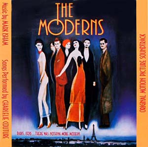
"One True Sentence" was partly inspired by my love of the Alan Rudolph film "The Moderns" which also mixes historical and fictional characters in 1926 Paris, just as Ernest Hemingway is burning down his first marriage and riding the buzz of his first novel, "The Sun Also Rises."

OTS was given a painted cover by the sublime Echo Chernik. Echo did a wonderful job of catching a sense of the dreamy, boozy, floating party that was Paris in the early 1920s — at least for the literary and artistic expatriate types stalking the Left Bank in those days. If Ms. Chernik had provided illustrations for the prior three Lassiters, branding-wise, we would have had something pretty wonderful, I think.

Look close at her illustration for "One True Sentence," and you'll find lurking behind Hemingway a pensive Gertrude Stein and a brooding Louise Brooks, (the silent screen siren is standing in for Hector's great love, fellow writer Brinke Devlin; Brinke is said to resemble Brooks in many ways).

For OTS's French publication, Belfond — which chose to market all of my books with covers featuring photographs of women — went this direction, cropping in close on the face of some 1920s belle: 


When the folks at Betimes and I began to discuss branding strategies and cover concepts for the Hector Lassiter series, we knew we wanted to put across location, some of the more recognizable historical figures appearing from book to book, and to give face to Hector Lassiter for the first time.

The latter wasn't particularly challenging. It was established very, very early in the series that Hector bears a striking resemblance to actor William Holden—a resemblance so strong, in fact, it becomes a key plot point in "Roll the Credits."

In laying out our plan for "One True Sentence,” the all-important cover we knew would be the tone-setter for the nine volumes to follow, we knew we needed Hector, Hemingway (who is Lassiter's sidekick in the novel) and something that telegraphs Paris.


We first arrived at an abstract approximation of the eventual cover. 

Wanting something more James Bama/neo-realistic, I resisted the impressionistic approach, and we ended up with the final cut, designed by J.T. Lindroos, who will at last be giving the Hector Lassiter series a uniform look across its span. 


At this writing, eight of the ten Lassiter volumes coming from Betimes Books have at last found their definitive covers.

All that remains are a cover for the climactic novel in the series, "Three Chords & The Truth," and a collection of short stories featuring Hector that we'll be calling, "Write from Wrong."

NEXT UP: TOROS & TORSOS


——————

ONE TRUE SENTENCE: Paperback/eBook

FOREVER'S JUST PRETEND: Paperback/eBook

TOROS & TORSOS: Paperback/eBook

THE GREAT PRETENDER: Paperback/eBook

ROLL THE CREDITS: Paperback/eBook

HECTOR LASSITER SERIES TOPS AMAZON.COM.AU

Thanks to Australian readers who pushed the Hector Lassiter series to the top of Kindle sales across all of Amazon.com.au during the past 24 hours!